OOOONNNNAAAAAAAPPPPOOOOKKKKKKÉÉ
The ultimate fish dish
Challenge & Action
Fresher, more modern, more photogenic, but no Hawaiian look... That was the briefing when we took on the redesign of the Zurich-based
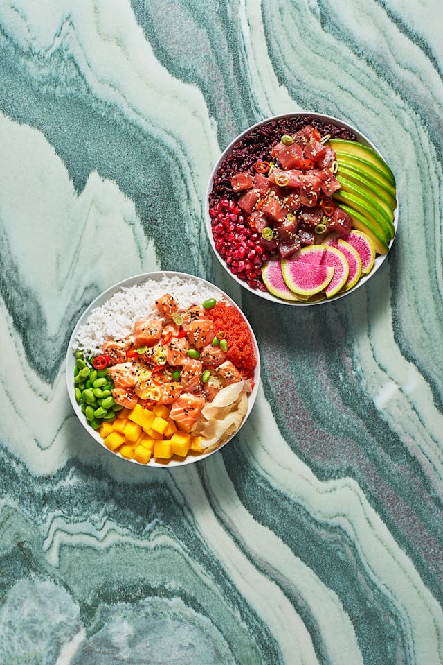
food brand ONA POKÉ. The demand for the highest quality ingredients as well as the fresh summer feeling when enjoying the bowls should be reflected in the new cross-platform design concept.ONA POKÉ is particularly popular with food bloggers and Instagram-savvy millennials. We took advantage of this for the new staging, developed a new photo concept for the bowls and embedded the existing logo in a sea of gold-yellow.
Result
A simple layout principle, which puts the fresh bowls in the foreground, enables a high recognition value across all platforms.
recognition value. Whether it's a tram hanger, a customer stopper or an Instagram feed - ONA POKÉ stands out.